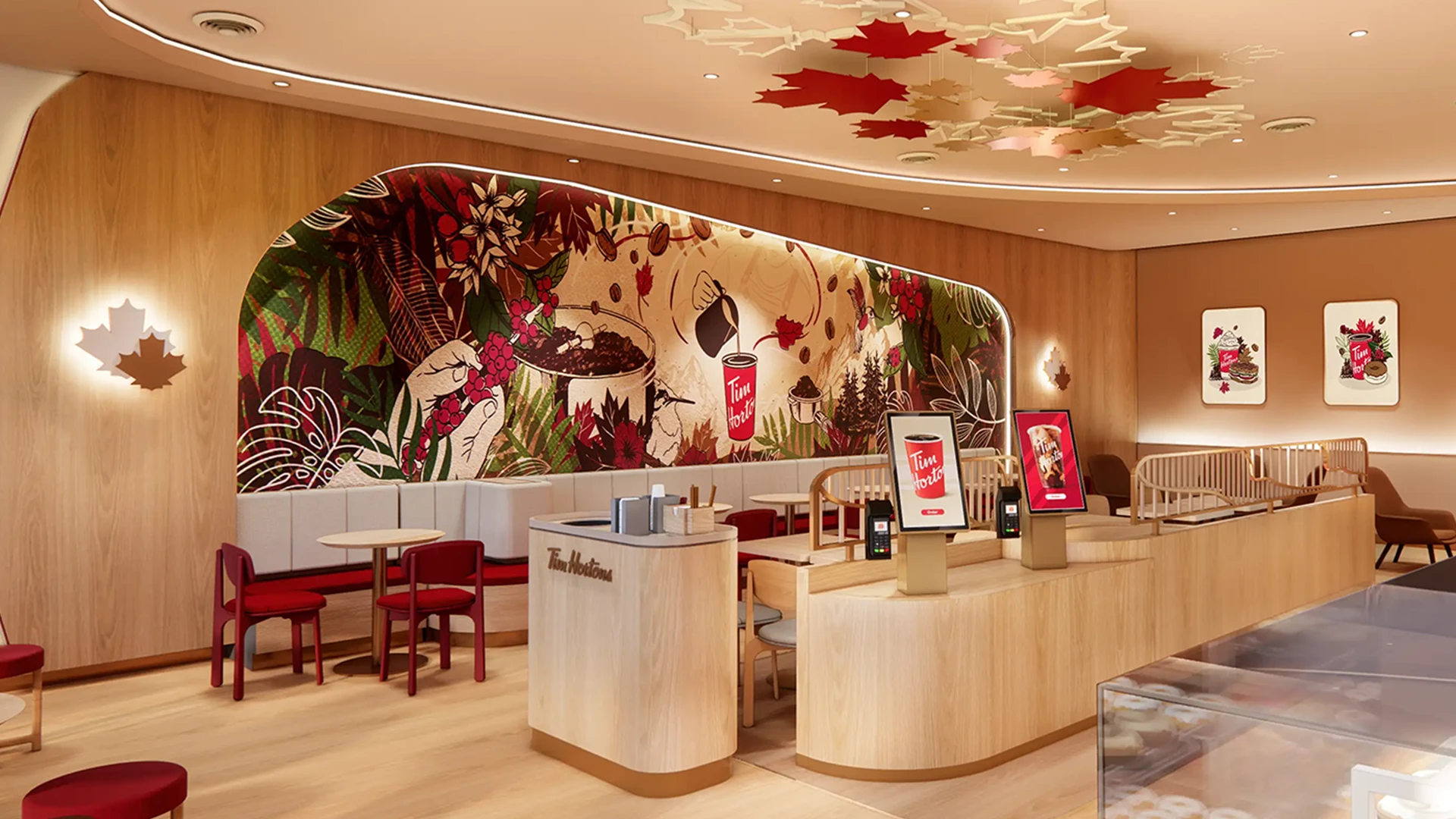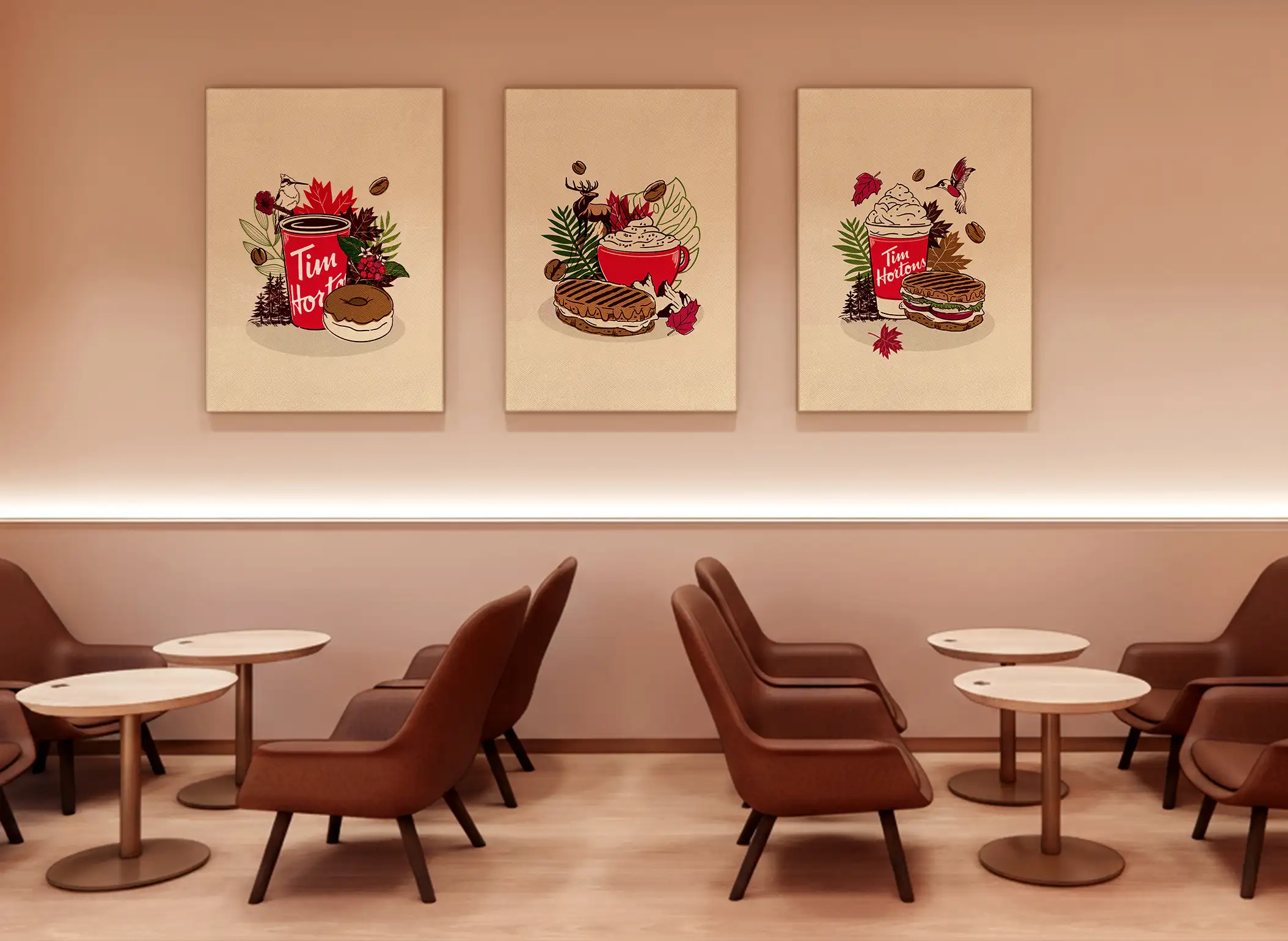

The Challenge
As Tim Hortons expands into new global markets, the brand needed to find a universal way to express its iconic sense of Canadian warmth through every touchpoint in-store.
Our challenge was to reimagine how the brand’s heritage, craftsmanship, and community spirit could live within its interiors, across wall art and environmental graphics, in a way that felt authentically Tim Hortons, yet adaptable across cultures and continents.
Our task: create a visual world that celebrates everything the brand stands for – always fresh, handcrafted, and unmistakably Canadian – while resonating with guests wherever the red cup appears.